Original Project: This was a project for a European client. With revenue goals set high for an e-commerce site with 5000 products in a competitive market this was going to be a challenge. Everything needed to be improved, from the website’s ease of use to customer service to product delivery.
Result: Right after the new website launched the monthly revenue increased 50-100% compared to previous months and year-to-year. We designed the logo, the colour scheme, most of the website, analyzed the old practices in place, and proposed exact new approaches in many areas.
Next: We’ll be back analyzing things when our client decides to take it to another level once again.
Website: http://www.pomocnik.sk/
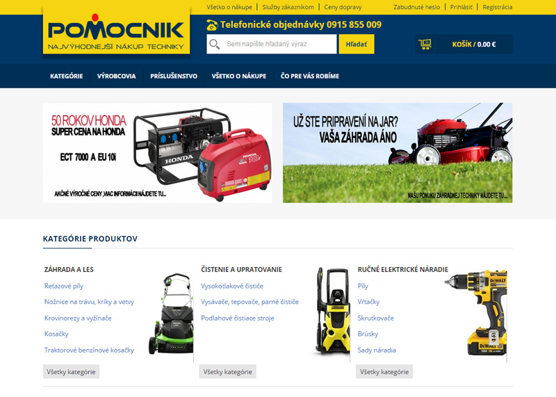
The new homepage. Logo was designed around the word “Pomocnik” that means “a helper”.
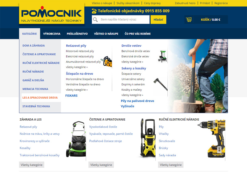
Quicker navigation to product categories was solved with a big modern dropdown menu.
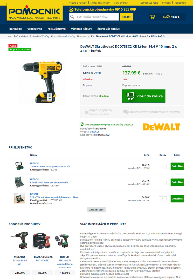
Product page displays lots of information but is easy to read and visually navigate.
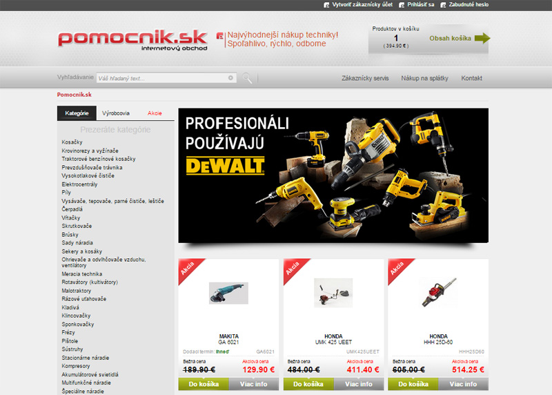
For comparison, here is the old homepage.